
Category spotlight: Interactive Visualization
With 24 fantastic interactives in the shortlist, here are just a few examples of what the category has to offer this year.
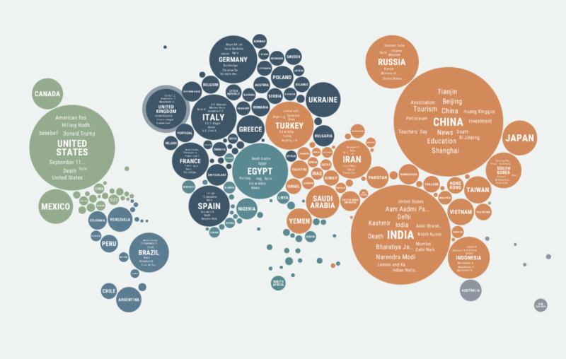
Robert Rouse examines US political divisions in US vs. THEM.

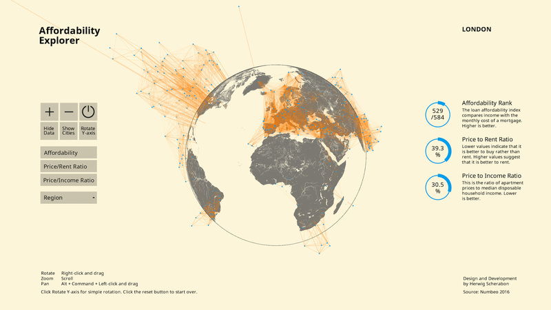
Can you afford your home? Herwig Scherabon investigates the relationship between income, house price & affordability.
Explore global reporting bias in Jigsaw's Unfiltered News piece.
Jason Treat and Jasmine Wiggins show us what 100% renewable energy would look like in the US, state-by-state.

:: Check out these entries along with the rest of the interactive visualization category shortlist.
:: See something you like? Cast your vote by clicking the grey button to the right of each entry.

