Where are they now: Hardik + Amy
In 2018 Amy Cesal and Hardik Chandrahas impressed and delighted dataviz fans everywhere with their creations exploring the mashup of Play Doh & data, and one man's life in the cycle lane. Read on to learn about what they've been up to since last year's Awards season.
Last week we checked in with previous winners Eric Lin & Aditya Jain.
Thinking about submitting your work to the 2019 Awards? Don't delay - the deadline to enter is 30 August. Enter here.
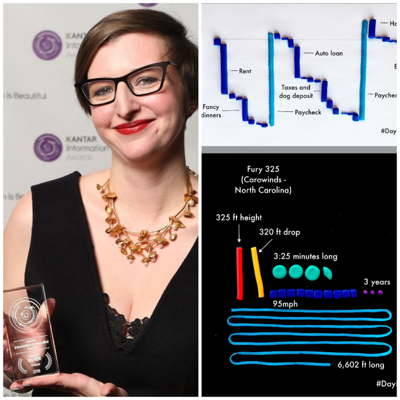
Amy Cesal: Silver Winner with 'DayDohViz'
Amy Cesal won Silver in the 'Unusual' category with her innovative work using Play Doh to visualize data points.
Amy, what inspired you to submit your work to the Awards?
In 2016, I finished a master’s program at MICA (Maryland Institute College of Art) in Information Visualization. It’s free for students to enter the awards, so I submitted several of my projects, a personal visualization workbook (mylifethroughdata.com) and fiftythirtytwenty.com. Neither of my projects won, but I was excited and honored to receive the silver Rising Star award in 2017! I didn’t attend the ceremony, but getting that recognition made me feel like I belonged in this community and was a real validation of my more out-there data visualization work - most of which I’ve done as side-projects on my own time. That experience inspired to submit more work in 2018 where my play-doh + data viz project, DayDohViz, was shortlisted and then won a silver award in the “unusual” category.
Being a 2x winner has inspired me to push myself to do more interesting projects, and to put in the time to take the design aspect of the visualization to the next level. It has also given me the confidence to take on more of a leadership and community building role within the profession, which felt out of reach before.
What have you been up to since winning Silver in 2018?
I got married and my husband, Zander, and I collaborated to create some unique data visualization pieces for our wedding. It was such a fun and meaningful event that I loved planning, but I’m also a tiny bit glad it’s over.
I also recently started the Data Visualization Society with a few other people, and it’s really taken off. We have over 6,000 members, have been centralizing a lot of useful dispersed resources, and launched an exciting publication all in the last 4 months! We quickly became a non-profit, and we’re working to add more structure and community programs like mentorship. It’s been very exciting to have so many other people in the dataviz community engage and participate in what we are building. It has been a real team effort, and I’m so excited for what it can become.
How did winning in the Awards impact your career?
More people know who I am and know about my work, which is fun. The play-doh project, DayDohViz, was especially a hit, I think because it was relatable and weird and tapped into a sense of nostalgia. It always surprises me when people know who I am. Especially at conferences. People who I look up to in the community now come up to me.
Being an award winner and gaining recognition has allowed me to lean into some of the weirder projects now that the Play Doh is “award winning”. I’m working on building out my play-doh data viz project into a full workshop. Without winning, I never would have thought this sort of side project had much general interest.
How can people get in touch with you and interact with your work?
You can find me on Twitter @amycesal or my website amycesal.com. You can also find me on the Data Visualization Society Slack if you join.
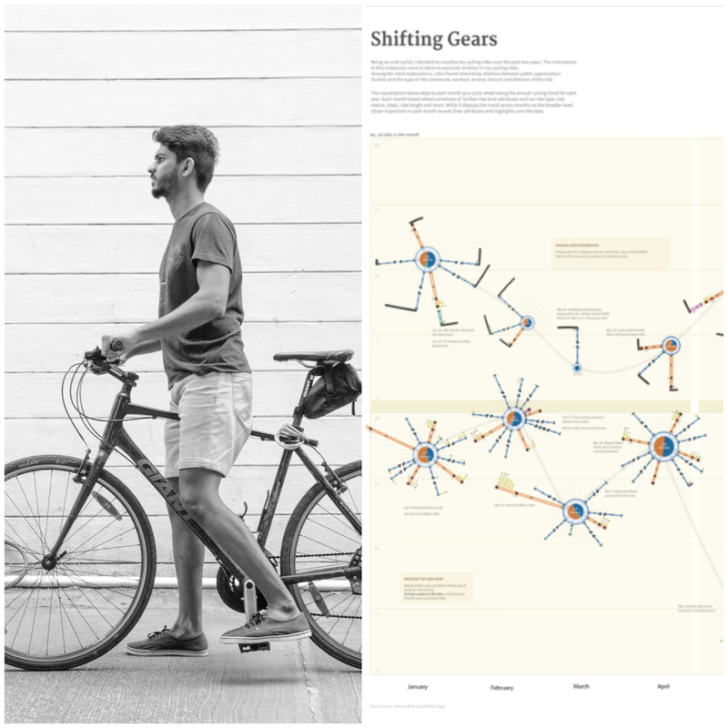
Hardik Chandrahas: Student Winner (tied) with 'Shifting Gears: Visualizing Cycle Rides'
Hardik Chandrahas tied for the top spot in the 'Student' category (see the other Student winner here). His work mined a plethora of personal data taken from cycling city streets over two years.
Hardik, what have you been up to since receiving the top Student prize in the 2018 Awards?
I have been pursuing my masters in Information Design at the National Institute of Design, Bangalore. As part of my course, I have been working on a couple of interesting dataviz projects. I did a narrative data visualization of the doping practices at Tour De France - the final result was a scrolly-telling web story.
I've also been working on a project visualizing the world’s longest poem, the Indian Epic Mahabharata, focusing on stories of the two most intriguing characters - Karna and Arjuna. Other projects include a study of global air pollution and some other cartographic visualization projects. Hopefully, most of it should be done by October. I’ll definitely try submitting some of these for the IIB Awards this year.
What inspired you to submit last year's project to the Awards?
One of my first data visualization books was Information is Beautiful. It introduced me to the world of data visualization and subsequently to the IIB Awards. Browsing the entries was extremely inspiring, considering the nature of the projects and level of talent featured in the showcase.
While pursuing my masters in Information Design, our professor and seniors told us about the Awards and urged us to submit our course work. The mere thought of being featured alongside individuals whose work has been a source of reference was enough motivation to submit my own work.
Did winning in the Awards impact your opportunities in dataviz?
It was thrilling to win in an arena I have utilized all these years as my go-to learning source. It did open up a lot of opportunities for me; from getting my first dataviz internship at Nutanix, to initiating conversations around data-based storytelling at several places. I was invited by the Processing Community to speak about my winning project and my other data visualization work at the Processing Community Day, Bangalore edition. The work is in talks to be published in a data visualization book, sometime later this year.
Where can you be contacted?
My work can be viewed on Behance or GitHub. I'm also active on Twitter and LinkedIn.


